ATTENTION! THE OLD WEBPAGE HAS BEEN CONVERTED TO AN ARCHIVE LIBRARY. lEARN mORE
YOUTH ACTION BOARD T-SHIRT DESIGN
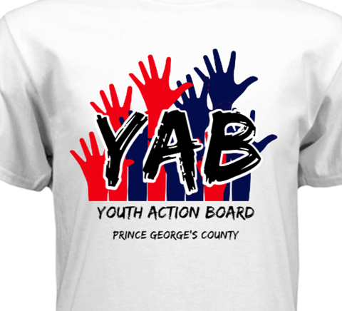
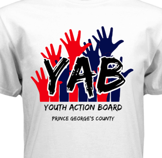
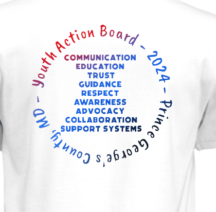

YAB T Shirt Designs Project that under one month was finalized to a set of designs including the set above this text. The group specifically requested the use of blue, black, and red, which were incorporated into the t-shirt graphics accordingly. I used their recommended site: RushOrderTees.com as a visualization tool throughout the design process to preview how the final product would look. This helped ensure that the sizing, fonts, and color combinations worked harmoniously together. After several iterations and group approvals, this design was selected as the official default version.
YOUTH ACTION BOARD LOGO PROJECT
Meant for Teams or Organizations such as a Youth Action Board of Maryland, purpose through symbolism was meant to capture in essence what the group is about. With the set of ideas and duties of what the squad does, summating all of that into one graphic picture. As far as both graphics, while certain foundational elements—like the Maryland flag theme—were preserved, new symbolic additions such as the butterfly, bird and the phoenix were introduced; all without deviating from the focus of what the LOGO is meant for.
DRENCHED LOGO PROJECT
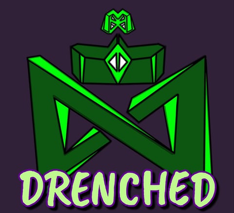
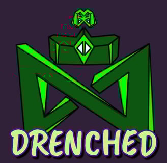
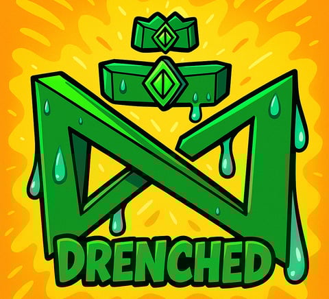
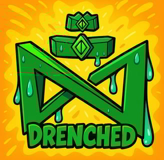
While still falling under the broader category of a logo project, this section focuses more on an individual client rather than a team or organization. In this case, I worked closely with a provided reference, refining the design through several stages—incorporating 3D rendering of the symbol, applying color theory, achieving symmetrical alignment, and more. These ideas gradually took shape, evolving into the image on the left before being finalized into the version on the right.
ANIME THEME BASED PROJECT
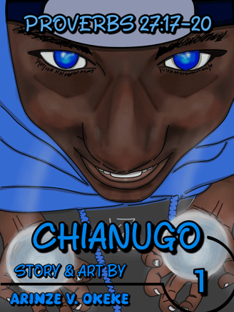
To the left is a visual with hard and soft lines complimenting one another to best bring out features such as the skin. Both rasengans and the person's face were both the main focus of this particular artwork. Multiple focal points here with all the whites from the eyes to the rasengans. The very first piece (of many I pray) involving thinking taking one reference idea and combining it with several other ideas from the posture, anime inspired elements and writing styles.
EVENT BASED PROJECT
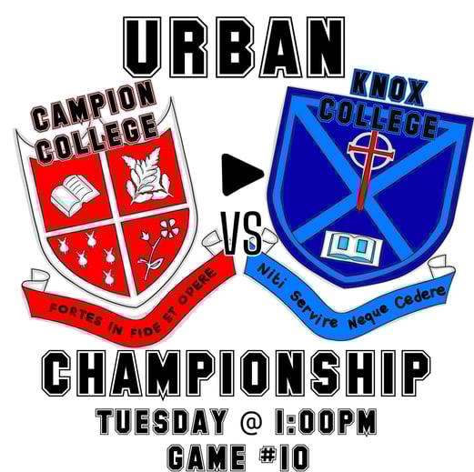
To the left is a flyer-themed design, created in direct response to the client’s specific needs and preferences. The primary objective was to effectively communicate the core details of the event while maintaining a clean, visually engaging layout. Special attention was given to balancing content density with clarity—ensuring that key information was easily accessible at a glance without overwhelming the viewer.
YOUTUBE PROJECT
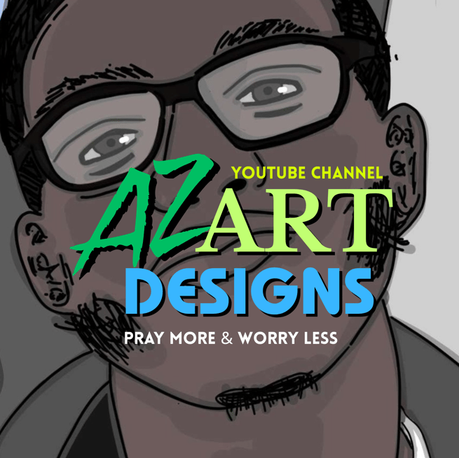
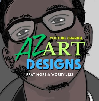
Az Art Designs proudly presents a YouTube channel dedicated to showcasing the intricate process of artistic creation. Viewers can embark on a journey that spans a variety of styles, from designing logos and vibrant cartoons to the detailed world of realism in art. Stay tuned for more exciting content, with the link to the channel provided below. Don't miss out on the chance to discover how art truly comes to life!
My artwork journey so far has being nothing short of a 'Spiritually Fulfilling Craftsmanship', guided to not only practice each day but share those gifts with others.
GETTING IN TOUCH
@: azartstudio99@gmail.com
#: 301-996-2757
© 2025. All rights reserved.
Discord: .crunchycandy